Utrecht University Library
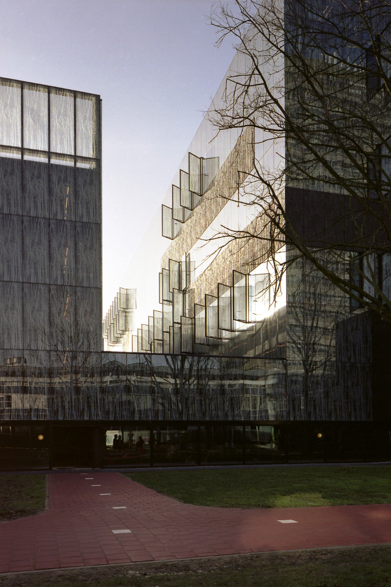
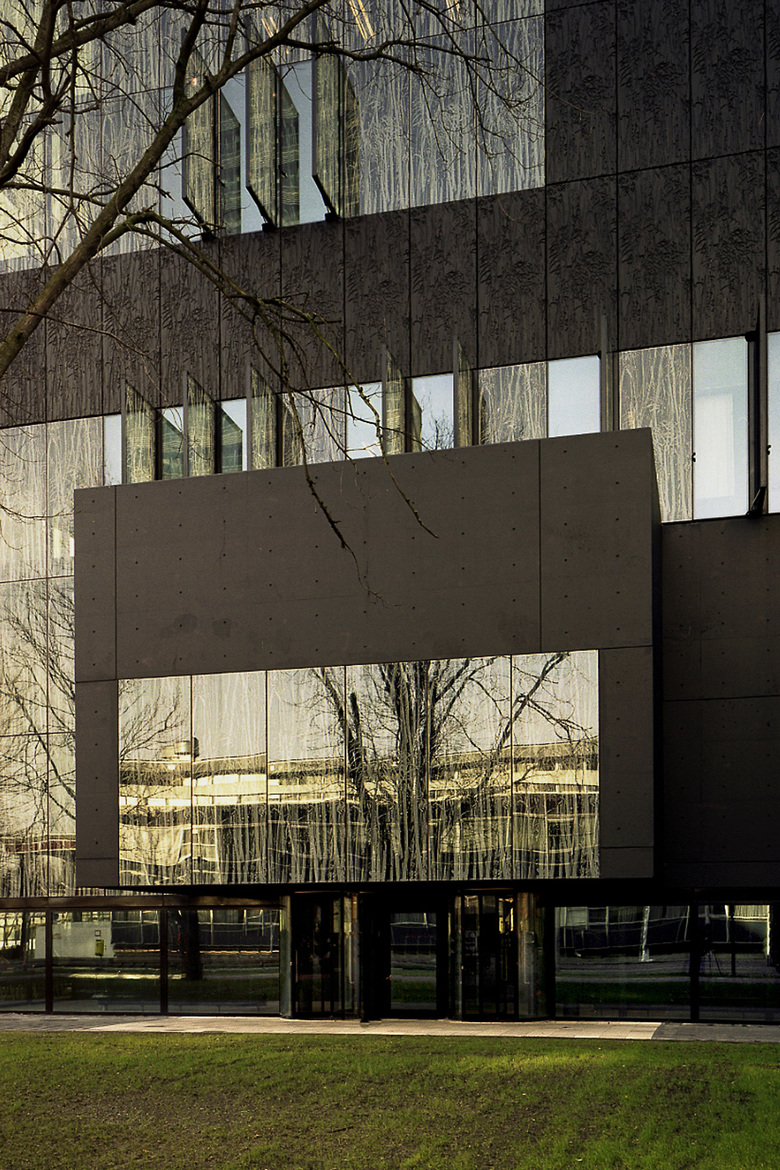
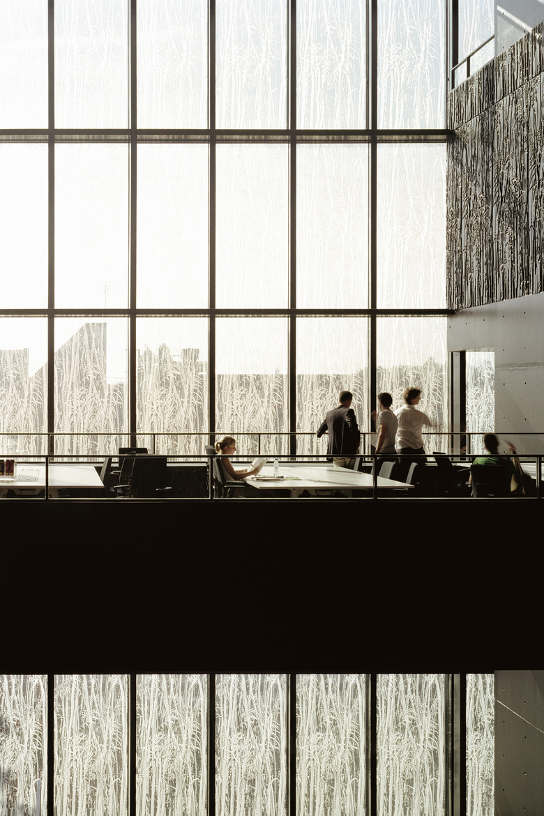
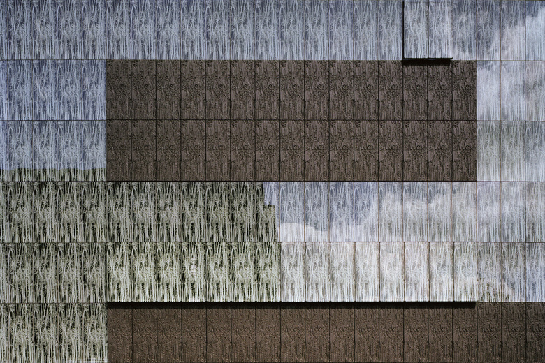
The Utrecht University Library, established in 1636, is located on the Uithof campus, situated a short distance from the city center. It is comprised of the library itself and an adjacent parking garage with multiple voids–between which is a courtyard garden and a café named for Johannes Gutenberg–and the fenestration of both is fritted with an abstracted image of fossilized papyrus. The relief of this image is imprinted on concrete panels, which are equal in size to the fritted glass panels; together they compose the building’s façade, and the concrete panels return within the interior.
This fritted glazing protects the library’s heavily rotated books, on open shelves, by softening the amount of daylight that permeates the interior, so that their shelf life longevity is substantially increased. Upon entry to the library, users are confronted with the café to their left, and an inviting grand staircase on their right–that ushers them up and into the first floor–which in essence creates a ‘zero-zero’ level that subsequently leaves the ‘ground floor’ undefined. The building facilitates both the group and independent study of students with 1.300 seats, 500 parking spaces, 560-student workstations, 300 librarian workstations, and an auditorium within its cavernous interior.
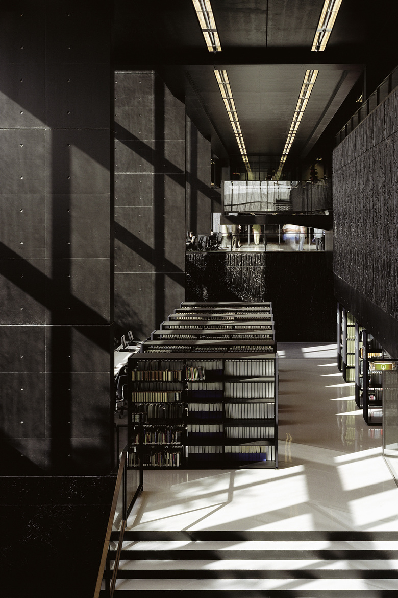
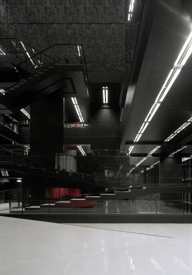
Its floors are finished in a glossy white polyurethane, while all other surfaces–with the exception of the custom designed orange-red furnishings, which denote areas of interaction with librarians–are painted matte black. Because of these finishes, when looking down from the library’s highest inhabitable space, white surfaces are predominately seen, while when looking up from below, matte black dominates. These opposing colors subconsciously direct users to their desired area: white surfaces denote circulation, while all black surfaces denote areas of study or contemplation. Individual study rooms are recessed off secondary circulation paths.
Where the library’s black concrete surfaces are imprinted with the papyrus relief, book stacks are to be found behind, as the library does not have one central book depot, and instead utilizes multiple stacks dispersed throughout each level, which seem to float like black storm clouds throughout the main space. When totaled, these stacks house more than 4.2 million books. The omnipresent color black is critical to creating the interior’s transcending atmosphere of concentration, security, and silent communication–all of which are essential to the integrated functioning of this distinctively refined university library.


