The Rijksmuseum
Amsterdam, Netherlands
Rehabilitation, Adaptation and Enlargement
The Rijksmuseum in Amsterdam was designed in the late nineteenth century by Dutch architect Pieter Cuypers. The function of the building was twofold: one part was the national museum, the other the gateway to the south of Amsterdam.
The museum use has paid an overly high price for its urban role as a connecting element between what was then the existing city –to the North– and the newer developments towards the South. A walkway - virtually a street - runs through the building from North to South splitting it in two parts, necessitating two entrances –both towards the North– and two main staircases; this means that only on the first floor are the Eastern and Western parts of the building are joined, while the ground floor and basement are divided.
The building has suffered many interventions over the last century: the need for exhibition space has meant building within the courtyards which led to a lack of natural light. This also brought to a kind of labyrinth in which the visitor is given no information concerning their whereabouts.
In summary, the museum suffered the usual lacks of museums of that period, i.e. a main hall unable to offer the proper capacity to the high number of visits and the need for essential services today such as information areas, shops, cafés, auditorium etc. In addition, the courtyards and galleries spaces lost their original size and shape.
The intervention on the building was, initially, meant to open up a new and unique entrance to the museum admission in the central passage hall, and secondly, to recover the courtyards and exhibition spaces, regaining somewhat their original state, or at least their dimensions.
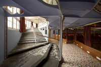
The first of these purposes could not be achieved due to the radical opposition of the cyclists, but it was possible to generate a large central hall to link the east and west courtyards of the building under the passage. The large space generated by opening and connecting courtyards houses all essential uses for visitors, and offers a suitable space on the scale that the grandeur of the building deserves. You enter this hall from the passageway, and the tours to the exhibition areas start at this point, linking with the original grand stairs.
In the new space created, natural limestone has been used as a basic material, a stone of a type not present in other areas of the building, but which allows us to unite the old and the new without complacency in the juxtaposition or contrast. This same material was used in the two new small interventions carried out in the garden. The courtyards, with a slightly sloping ground, are connected under the passage, and on each of the structure with an acoustic and lighting mission has been suspended, 'chandeliers'.
- Architects
- Cruz y Ortiz
- Location
- Amsterdam, Netherlands
- Year
- 2013
Related Projects
Magazine
-
-
-
-
Un despatx madrileny signa un visionari catalitzador urbà en West Palm Beach
Andrea Pala | 29.11.2018 -
L'arquitectura de Francis Keré en escena en el Museu ICO de Madrid
Andrea Pala | 28.10.2018


