Kid's Republic
Beijing, China
Ribbon Surrounding / Intertwining
Colorful ribbons that “wrap” the space and colorful ribbons that “twist” in space? these two types of colorful ribbons create a place that both creates and cultivates the curiosity of children.
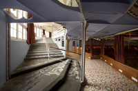
KID’S REPUBLIC in Beijing has an activity room on the first floor and a children’s bookstore on the second floor. The activity room on the first floor is a rainbow-like space created with 12 colorful ribbons of different perimeters. Activities like story-telling and animation shows are periodically held here. The section gaps in the wall and ceiling are used for illumination or displaying items, while those in the floor are also used as a stage and an auditorium. Carpets are laid in the room for children to freely sit and lie down on the floor.
The stairs leads the children to the bookstore on the second floor. The rainbow-like ribbon starts from the hall and goes up along the stairs till the bookstore. The 100-meter-long colorful ribbon, which serves various functions at various places, whirls and twists in the store; it finally ends in the room and goes back to the armrest of the staircase baluster on the first floor where it had started.
The front covers of children’s picture books have rich and bright colors. In comparison to those bookstores selling professional books, the collection of such picture books can produce a cheerful space. No orderly bookshelves can be found here, and children can sit in places that appeal to them and read the picture books at their own pleasure. The colorful ribbon starting from the stairs twists and whirls in the store, and it comes in contact with the bookshelves, tables, gate, checkout counter, and ceiling, and finally, the armrest of the stairs.
Holes of different sizes are designed on the bookshelves against the wall, serving as not only windows to pass internal and external information but also as reading spaces for children. The scenery of children sitting and reading not only decorates the elevation of the store but also gives the appearance of a delightful store to people on the outside.
Interior design generally classifies the floor, wall, ceiling, and furniture into different components. This is an easy way to sort out articles and establish a certain order in the adult world. The design in this case does not consider any of these since the sensibilities of children do not tend toward the abovementioned components. There is no separation for the children to read and play. I tried to make the space more intuitive and free by the design.
- Architetti
- SAKO Architects
- Sede
- Beijing, China
- Anno
- 2005
- Cliente
- 北京蒲蒲蘭文化発展有限公司
- Team
- Principal Architect: Keiichiro Sako
- Interior Design
- SAKO Architects
Progetti collegati
Rivista
-
-
-
-
Un despatx madrileny signa un visionari catalitzador urbà en West Palm Beach
Andrea Pala | 29.11.2018 -
L'arquitectura de Francis Keré en escena en el Museu ICO de Madrid
Andrea Pala | 28.10.2018


