GAT Berlin
Mauerstraße 81-82, Berlin, Allemagne
The project was born from the desire to transform an industrial building, built in the 80s, for the adequacy of this hotel. Its unbeatable location within the city of Berlin, along with a very characteristic topology of the city, the succession of semi-public patios, invite to retain its main features, although the building itself has no interest. In this sense, we can say that the prefabricated structural system of retaining walls, fits in modulating rooms, but does not help to speak on a floor that must necessarily breathe a characteristic of a hotel topology spacious environment.
On the other hand, an existing servitude from the street to the patio, through the courtyard of the building, originally appeared as a problem, to become the virtue and main feature of the proposal to the ground floor. The traffic of cars and pedestrians into Apple allows that access to the hotel occurs within the semi-private courtyard of the building, along with small interventions in the street parallel to the walls, emphasize the connection and permeability of the building from the large interior of street block. Thus, serfdom initially raised as a grievance, becoming just the element that transforms the courtyard and the lobby on a street full of life and activity.
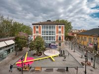
The facade is presented as a continuous element and serves starting to introduce a composition with a classical order of base, shaft and capital, which characterizes the facades with us. Thus, conforms to the architectural conditions where it is placed. The current facade participate in the overall composition of the street, which enjoys a large space-plaza on the opposite side, offering the possibility of a front view of the grand facade, produced by the sum of each of the buildings. The vertical composition and the four tones that exist in our facade, no help reinforce this overview. This tripartition, is recognizable in this new proposal through changes shade of gray, applied on phenolic panel, appearing as a continuous skin. The colors mimic those that already exist in neighboring facades. The two tones; dark to the capital-covered and very light gray to the basement-floor gray frame a succession of two very continuous tones, allowing a reading of the central part homogeneously The windows emphasize the character of the buildings in the street with openings marked on horizontal lines, which increases its density, to suit a housing topology. The overtures of the top two floors tilt and show his carpentry outwardly playing the character of skylight holes in the roofs of the neighboring buildings.
- Architectes
- BOPBAA Arquitectura
- Année
- 2010
- Project Status
- Construit
Projets liés
Magazine
-
-
-
-
Un despatx madrileny signa un visionari catalitzador urbà en West Palm Beach
Andrea Pala | 29.11.2018 -
L'arquitectura de Francis Keré en escena en el Museu ICO de Madrid
Andrea Pala | 28.10.2018


